How Much Instant Dry Yeast To Go With One’s Wheat Storage
Wheat can store well for many decades and some people have stored a lot of it. But do you have enough instant dry yeast to match?
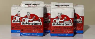
Wheat can store well for many decades and some people have stored a lot of it. But do you have enough instant dry yeast to match?
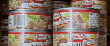
Hormel Smoked Ham. These little cans of goodness are part of my diversified stock of canned foods. Here’s why…

While considering how much emphasis should be applied to any of the many prepping and preparedness topics, a few stand out.
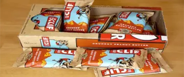
The CLIF BAR looks to be one of the best energy food bars to consider, and here’s why…

An EMP can damage or destroy the electronics underpinnings within a wide variety of devices and systems that we completely depend upon.

Good radio communication etiquette and procedures for 2-way radio protocol, to help the beginner.

This is perfect if you’re looking for one of the best lightweight 12V batteries for applications such as an electric trolling motor.

Today’s popular best choices for a reasonably priced biometric handgun safe. And, a nice slider model, great for nightstand or bedside…
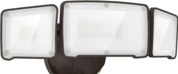
My favorite solar motion outdoor security light that has been running flawlessly for years and still going strong.

The original Lewis and Clark packing list for their Expedition of 1804 up the Missouri River.